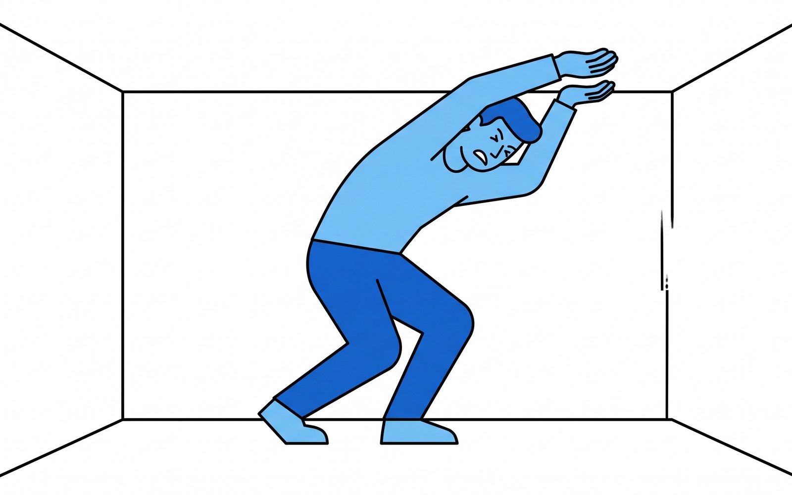
There’s a screen I keep meeting in different products. It looks clean. Lots of white space, a few controls, restrained type. And people still stall on it. They read the same line twice, hover over a field without filling it, click into a setting and back out. It photographs like good design and it behaves like a wall. The mistake underneath it is one of the most useful in all of interface work, and it comes from a single fact about the brain: simple to look at and easy to think through are not the same thing, and you can nail the first while wrecking the second.
The vocabulary for this comes from cognitive load theory, developed by the educational psychologist John Sweller in the late 1980s. Its starting point is one this series has visited from another angle: working memory — the mental scratchpad where you hold what you’re actively thinking about — is astonishingly small and fragile. (The piece on Cowan’s “magical number four” is about that capacity — roughly how many chunks you can hold at once.) Cognitive load theory asks the next question. Given that the budget is tiny and fixed, what are you spending it on?
Two of the bills are not the same bill
Sweller’s key move was to split the load on that scratchpad into kinds, and two of them matter enormously for anyone building an interface.
Intrinsic load is the difficulty baked into the task itself. Setting up two-factor authentication genuinely involves a few interacting ideas; reconciling an invoice genuinely has moving parts. You can sequence this load, you can break it up, but you can’t wish it away — the task is as complex as it is.
Extraneous load is the difficulty added by how the thing is presented — everything the user has to hold in mind that isn’t the task. A word they have to decode because you used your internal jargon. A value they saw on the last screen and must now remember because you didn’t carry it forward. A control that behaves differently here than it did two steps ago, so they can’t trust the pattern they just learned. An instruction sitting in a corner far from the field it governs, so the eye has to ferry the rule across the screen and hold it there. None of that is the task. All of it is spending the same scarce budget.
Here’s the part that reorganizes how you look at your own product: you can’t lower intrinsic load, but extraneous load is almost entirely yours to give or take away. And when the two together overflow the budget, the brain doesn’t gracefully queue the excess. It drops things. The user loses the thread, makes a slip, re-reads, and — often — quietly leaves. Most onboarding I’ve seen fail didn’t fail because the underlying task was too hard. It failed because the presentation ate the working memory the task needed, and there was nothing left to actually do the task with.
The build decision: hunt extraneous load, not pixels
The instinct, once you feel this, is to strip the screen down. Fewer words, fewer buttons, more air. Sometimes that helps. But minimum pixels is not the goal — minimum extraneous load is, and the two come apart more often than you’d like.
Hide a label to look clean, and you’ve forced the user to recall what a field does instead of recognizing it — you moved work off the screen and onto their memory, which raises load. Bury the one setting they need behind a tidy menu, and they now have to hold “where was that?” in mind while they hunt. A gorgeous, sparse screen that leaves people guessing where to go is not low-load; it’s extraneous load wearing a nice coat.
So the audit is specific, and it isn’t about taste. Walk your own first-run flow and, at each step, ask what the user is being made to hold in their head that has nothing to do with the task: a term only your team uses, a number they have to remember from a previous screen, a control that broke the pattern, an instruction parked away from the thing it explains. Each one is extraneous load you can hand back. Carry that number forward instead of asking them to remember it. Put the instruction inside the field it governs. Keep one control behaving one way everywhere, so learning it once buys it forever. Name things in the user’s words, not your schema’s. None of that removes a single real step of the task. All of it clears budget for the task to happen.
And where the intrinsic load is genuinely high — a real multi-part task you can’t simplify — the move isn’t to cram it onto one heroic screen. It’s to sequence it: reveal it a chunk at a time so the scratchpad only ever holds one part at once. You’re not dumbing the task down. You’re making sure the user’s tiny working memory is spent on the task instead of on your interface.
The next time a clean screen quietly loses people, don’t reach first for the visual design. Reach for the load. Count what the user has to hold in their head that isn’t the job. That count, not the pixel count, is what they actually feel.
The science, to look up: cognitive load theory and the intrinsic / extraneous / germane distinction (John Sweller, 1988; Sweller, Ayres & Kalyuga, Cognitive Load Theory, 2011); the split-attention effect (Chandler & Sweller 1991/1992); working-memory capacity (Cowan’s ~4; Miller’s original “seven”). These are well-supported instructional-design findings; exact magnitudes depend on the material and the learner — treat the direction as solid, the numbers as approximate.
Sources
- Cognitive load theory (John Sweller, 1988)
- the split-attention effect (Chandler & Sweller, 1991/1992)
- working-memory capacity (Cowan's ~4
- Miller's original seven)
Liked this? Get the next one in Working Theory.
Going weekly in August (it's in beta now). One genuinely interesting read on building, the brain, and the science most people missed.
Subscribe →